Maudio
A museum audio guide – reinvented
A museum audio guide – reinvented
While taking part in the Google UX Design certificate program, students were challenged to do multiple design projects. The exact challenge (what product to design) was chosen randomly, which for me was the museum audio guide. I then started with foundational research, then completed multiple studies, low-fi to hi-fi prototypes and much more. The main steps during the design process of Maudio are described below. Of course, this is only a summary of the whole process and many things were omitted. For any questions, you can find my contact info here.
Almost all museums still have the old-fashioned classic audio guide, which is some kind of physical device that has basic playback settings and some headphones attached. The museum must keep all of them charged and maintained. This leads to big costs for the museum, which in return the museum then must charge back to the user.
The visitors are typically from all age groups, have many technical backgrounds and speak different languages. Also, art should always be as accessible as possible, especially keeping color-blind and people with hearing difficulties in mind.
I tried to take all of it into account and design a product which satisfies the above.
This project was done solely by me, but I conducted studies and interviews with users to get as much information as possible. Based on this information, I then made my design decision and constantly sought to validate them.
I conducted 5 interviews with people between 20 -70 years old who have visited different museums, to get a better picture of my target group. My Focus here was to identify the main pain points. The results can be seen here:
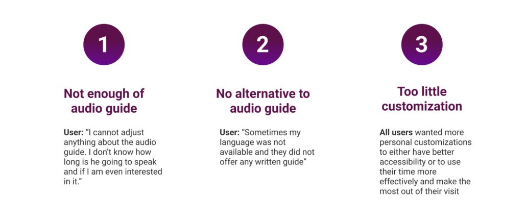
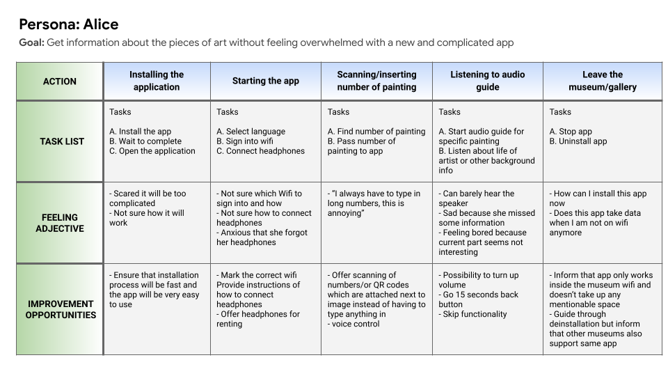
The next step was to develop personas for each user group. I am not going to name all the personas here. One persona was Alice, a 58-year-old female who goes to museums just for fun and doesn’t want to be stressed about using the app. Also, for her, it is very important that she can adjust the audio guide in a way that she is still in full control.
Here you can see Alice’s user journey map:
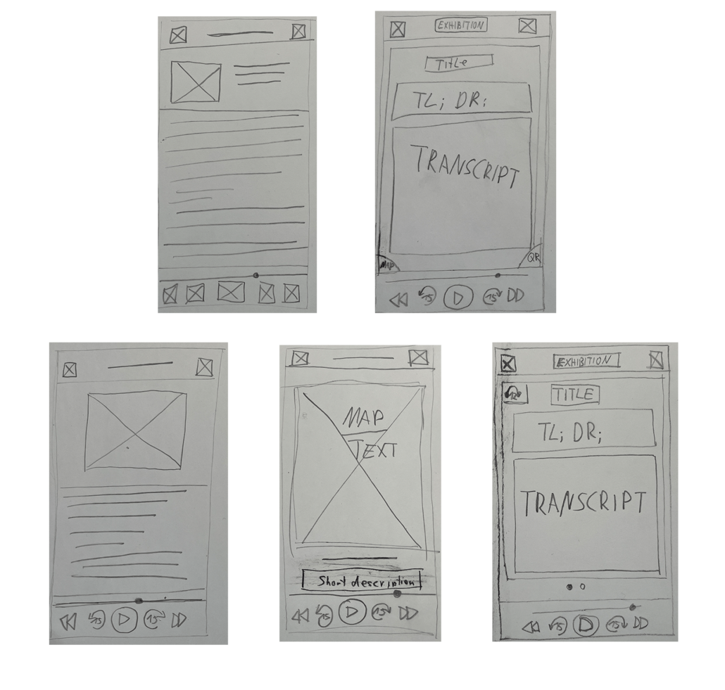
After the pain points and my users were clear, I started drawing some paper wireframes. A few can be seen here:
Then after I decided on my favorites, I drew them in Figma:
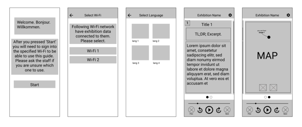
After I was happy with the wireframes, I created a testable prototype in Figma. This step is essential because it validates (or revokes) your design decisions because you can let people test it while observing them. Click on the link to see the low-fi prototype in action:
Link to my lo-fi prototype.
As described, I then conducted my second interview. Observing the users, I was able to extract 4 key insights. These are all problems that occurred while testing and can be categorized by their urgency, P0 being the most urgent issue. Furthermore, I recorded 2 KPIs too later, being able to verify that my design changes will have a positive impact.
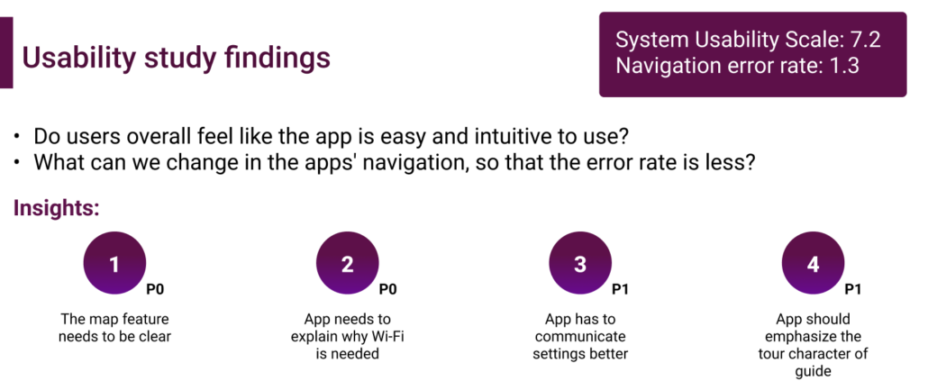
I listened to the users and created mock-ups, keeping prior feedback and difficulties in mind. For that I created a small design system where fonts, icons, color, and some components are pictured.
One big focus was that the colors for text and images would work well together so that the app is as accessible for all people.
Then it was time to create a high-fidelity prototype. I used once again Figma for it. The video shows you the basic user flow from start to end. I tried to keep it very simple and intuitive.
I have learned a lot of things during this design challenge. My main takeaways are:
I have also successfully passed the Google UX course. Checkout my certificate 🎉 and see my grade.